Internet has become a mad place. It’s speed and adaptability has paced to the level where one single night is enough to change the whole trend. New features take over complete web within hours. Take an example of Instagram’s new feature IGTV. Its been a day and number of IGTV videos has reached millions.
If we look in the closet of web development and think about changes, this world has a whole new criterion for accepting changes. A developer sees something new, he likes it and then tries to incorporate it into his own design. The chain continues and eventually the trend evolves into a new sensation. The madness of modern colors and minimalism in designs is one of these sensations.
With time, themes have become minimal in design and bold and modern in colors. There are many eye-widening themes that become a perfect example for this. So, today we bring you 10 themes that will make you fall in love with the evolved art of CSS.
1. The North theme
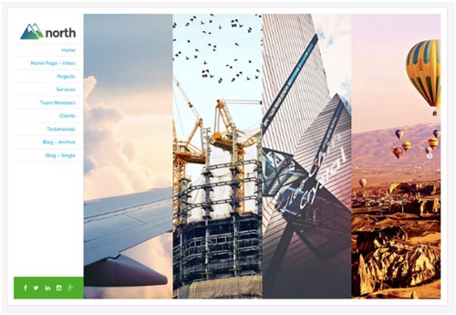
This theme by modern themes is a perfect example of what we can call ‘simplicity at its best’. It has a simple, clean yet cool navigation bar which gives a complete access to whole theme once you click the options. Navigation bars on the left side were standard and out of fashion, but this particular theme brings the old ways back to life
Demo: The North theme
2. The shopkeeper

Envato market never disappoints its users. This theme is a beauty piece for anyone’s eye. Use of bright color, direct display of pictures and a not so messy look makes it a wanted and adored piece.
A theme that embraces the use of modern colors. It is a perfect theme for an e-commerce fashion shop.
Demo: The shopkeeper
3. Scroll me pro
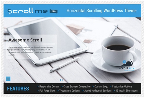
A theme that has its navigation bar at the bottom.
Yes, you read it right. Scroll me pro has its navigation bar at the bottom. A WordPress theme making a new fashion statement, a big risk. But the risk is worthy because it looks marvelous. Scroll me has a different element of look which makes it different from all others.
Demo: Scroll me pro
4. Arnold
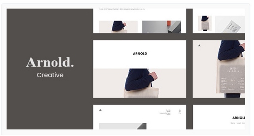
A responsive portfolio theme from themeforest. Looks to die for, it is minimal of all. Plain white background with pictures and black text. It is a master piece created and a tight example of what a minimal and modern theme should look like.
It is subtle in look but can hold a lot of information.
Demo: Arnold
5. Pool by template monster
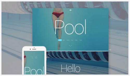
Just like its name, the theme is blue and fresh. It is a WordPress theme that gives a sense of freedom within water and a feeling of its flow. A permanent homepage with changing elements like about, blog and other pages keeps the focus on the bold letters ‘pool’.
A simple background and a navigation bar, what else do anyone need?
Just kidding, the clean look as a landing page is what makes this one special.
Demo: Pool
6. The ulite portfolio
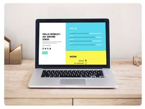
Another portfolio theme but completely different from the one earlier. This theme from UICardio is the simplest HTML but the boldest use of color. The best example of modern colors and a bold choice of design. An outstanding and undeniable perfection.
Portfolios are must if you are a designer or a developer. Just imagine this bold portfolio describing your experience and work, what an impression!
Demo: The ulite portfolio
7. Radius
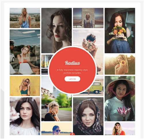
A responsive and killer photo gallery template. If you are a photographer and are looking for a template that compliments your hard work of clicking amazing pictures, you should definitely take a look at this one.
This template will not only display your skills but has a large area where you can put your work for display, your pictures.
What else does a photographer wants?
Demo: Radius
8. Diffuse
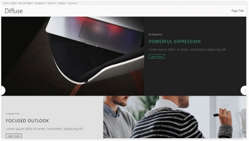
Diffuse from bindtuning is an example of beauty in minimalism. You get everything in this, everything you can imagine of. Everything is simply laid in perfect places. With no scope of a mistake or forced elements, this theme makes into one of the best choices for a company website.
Demo: Diffuse